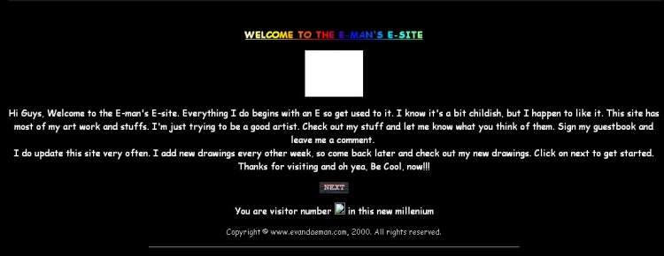
I added this page for myself. I've redesigned my site a few times over the years and I now wish I had kept the templates to tell myself on how my skills have grown over the years. These screenshots below are taken from archive.org.
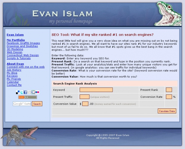
What you see is what you get. The site you are viewing now is the latest of course. CSS driven custom site that's built with SEO in mind. Credit for this site goes to my American Best IT team for building a badass site I love.
I started Central Station Marketing in May 2013 and I started a brand new project to build a fully functional content management system to manage all the sites I was about to build for clients. I build my own site in this new platform as a test site to make sure I can do everything I need to do for my clients. The system started with a handful of modules
That's it! That's all that was needed to start a business. I called it, Jupiter. Of course, now the Jupiter platform has evolved as we have multiple engineers working on it and building bad ass templates and modules.
For 2007, this was a pretty cool design. I was getting into CSS and this was my first attempt at a unified CSS file and updating content through a CMS. I built the CMS from scratch and all content, navigation, header, footer, and everything else was managed through the system. This was called Shapla CMS. I built a system to manage my own sites while I was working at Basement Systems.
Of course, the system I built for Basement Systems was much better and with more features. My personal system was bare bone with me as the webmaster in mind. So not a lot of features needed. My little CMS was good enough to keep up with a handful of personal projects.
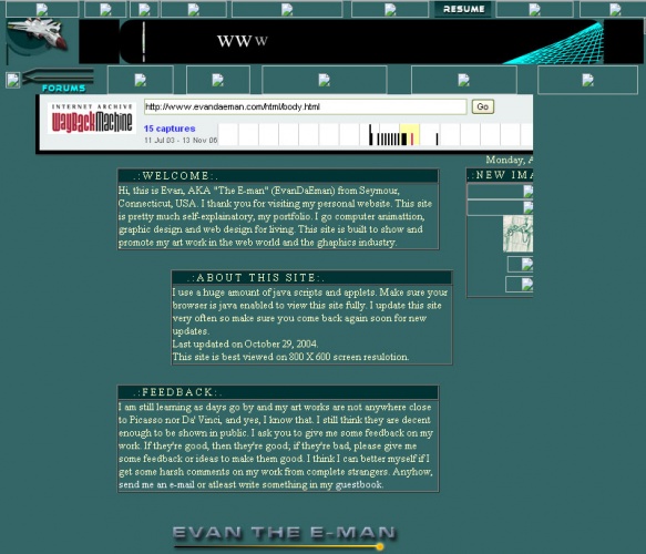
This site was done in Frames. Maybe that's why the screen shot didn't do a good job capturing all the content and design elements. This functioned well though. Frames were a big thing back then because you can keep all navigational items, header footer same across the platrom with one file.
I didn't know how to build sites in PHP back then and wasn't introduced to the concept of "include". My header was done in Flash for cool animation.
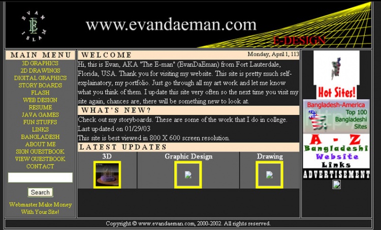
This was done pretty well for 2002. I wanted to have a site that had timely updates and stuff. But the problem was, I was manually adding the date sensitive content and databases weren't a option then for me.
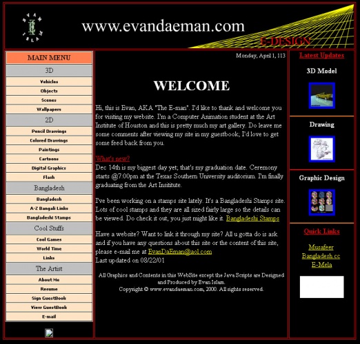
Wow, this was my first redeisgn of my site. I had learned to use tables and colors. For 2001, this had to be one of the best looking personal sites ;) I even had a cool Flash banner as the header. Flash was the newest and hottest thing around back then.
Ahh, my first site ever. As you can see it's just a basic text on a page. Of course, the site had some rotating gif animations, under construction signs, email icons and other fun stuff. It was cheezy but at least I had a web site.